Blog for Assignments
o(°∀°)o
Sunday, November 22, 2009
Visual Techniques
singularity, neutality, instability, simplicity, activeness, depth
economy, flatness, accent, simplicity, asymmetry, instability
Both of the book covers above has used the technique of simplicity. Because they don't have many details, the visual messeges are very easy to see. However, the first one has depth and the second one has flatness. The first one tends to have a feeling of space and it help to create a sense of reality. The second one chooses to leave out the feeling of space and it shows the strong contrast between the object and the background. These two covers are also similar in the way that they both are imbalance. The first one is the chairs and the second is the book and the person. However, their effects are different. Because the neutrality of the first cover, the feeling of imbalance is not as strong as the second one. It just suggest the motion of the chair which conveys the message of reliability and the relationship of love. The second one has the technique of accent and it amplified the effect of imstability. It makes the illustrarion of the book in the cover seems to be a burden to the person which effectly depicts the title of the book. Both of these books use visual technique successfully.
Sunday, November 8, 2009
Week 11 CONTRAST in design
The image above is a sucessful example of using contrast in the design.
The designer use contrast in color and sucessfully attract viewer's attention. Yellow and white on the gray background create enough contrast. The designer also apply contrast in compostiion. Circles on the cover do not place orderly and regularly. Some of the circles are being "pushed" away from the oringinal place. It sucessfully conveyed the message of the title of the book. Overall, the designer puts enough weight on both the book title and the illustration, so it does look too leveled.
Images above is an example of bad use in contrast. The rainbow color on the web page lower the contrast effect and become intrusive and messy. The compostion of this site is the worst problem. Too many things are crammed in this page and it does not have a hiearchy and it does not direct viewer's eye. This unorganized page has no control on visual statement. The result is ambiguous and the effect is frustratrating for viewers.
Reference
http://seenbooks.blogspot.com/2006/12/disorders-of-memory-and-learning_08.html
http://www.burlingtonnews.net/burlington_ufo_center.html
Sunday, November 1, 2009
Implied Movement in Design
The poster above is an example of using implied movement in visual design. By applying diagonal stress in the poster, people tend to follow the direction of words. Moreover, we perceive movement because in Getalt law we expect to see patterns to continue. Variation on sizes of fonts also suggest change and movement even though nothing moves. This poster conveys the energy of movement. All the factors are working together to create a strong visual effect.
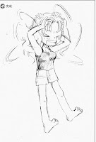
This is also an example of implied movement. In the picture above , we can see that a girl is scratching her hair.
Lines around her hands suggeset the direction and the movement of her hands. Because of that, we can feel that her hands are moving although it is a static picture. The extra two arms tell the viewers the starting position of her arms and this enhance the movement of her arms. Also, depending on the context (her expression and lines), we can interpret that she is scratching her hair rapidly. The effect of this picture is very strong and clear.
Subscribe to:
Comments (Atom)


