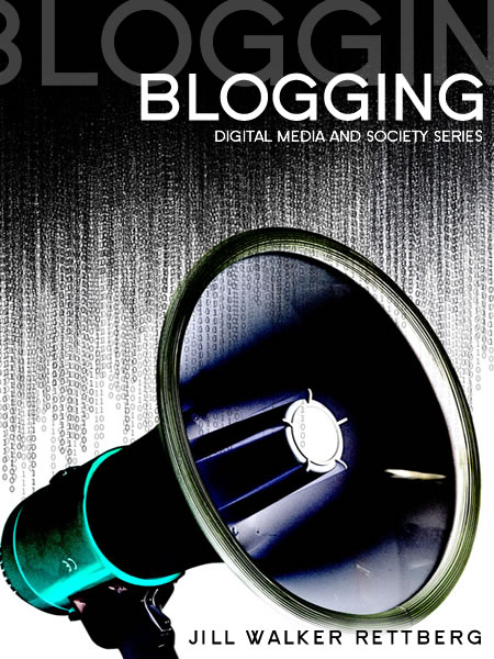
I found this book cover is not so good because it looks
uncomfortable. The monotone background created the feeling of leveling and the layout of the types are balanced. However, it doesn't tell much about the book and it can hardly catch people's attention. I think the readers would be easily misunderstand the book just by looking its cover.
I belive this one is more appealing and better. The layout of this bookcover is imbalance and it makes a focus to people. The background looks very dynamic since the strokes creates stress and suggest a feeling of motion. It show the impact of the loudspeaker which relates to title of "Blogging" and its influence. I thnk it conveyed the message more sucessfully.
Blog for Assignments
o(°∀°)o
Sunday, October 4, 2009
Sunday, September 27, 2009
Visual Language


Manga is the Japanese name for comic and pictures above are two different manga series that are translated in Chinese.
The picture on the left is showing a fighting between three monsters and a "gorilla" is running away from the battle after it see that one of the monsters is eating two other monsters.
First, it shows the scene of the fighting and then shows the power of the winning one (it begins to eat another). After that the scene changes to the "gorilla" and shows its expression. The dialogue frame is in the irregular spiny shape to show the cries and emotion within them. Finally, the panels are showing scenes that the "gorilla" decides to run away.
The layout and sequence of the panels is according to the reading style of Japanese which is the right to the left. The eye movement of people who used to this reading style will read from the right to the left and from the top to the bottom.
The picture on the right is the conversation between the women and the man. It shows the rejection of the woman and the response of the man. It emphasis on the scenes and the dialogue of the women in order to show her feeling and her expression.
In the manga, exaggerated facial expressions and movements are used to show certain qualities like humor, scare, and surprise. Also, the background under character may be used to show the feeling of the character by applying focus line, lighting, flower, bubble, mist,hazy rings, shadow,etc.

Sunday, September 20, 2009
Visual Thinking Research
The result of my brother

The result of mine

For the stained-glass one, basically it just need the least amount of strokes to finish the pattern.
Both of us tried to draw the inner part first then finished the outer circle. The drawing process for inner parts are pretty similar: we used longest lines to reduce the turns. However, our procedures of how we deal the outer parts are different. I tried to finishe the circle first and completed the last two straight lines and he tried to finished the straigt lines first. Therefore, the numbers of strokes we used are different.
For the space one, it also the least amount of lines possible to close all the spacepods. Both of us failed to use the least amount of lines ,which is four, even though our strategies are similar. We want to draw lines that can across space between as many spacepods as possible and then close up them. However, we failed to find the best spot. His result is 5 and my result is 7.

The result of mine

For the stained-glass one, basically it just need the least amount of strokes to finish the pattern.
Both of us tried to draw the inner part first then finished the outer circle. The drawing process for inner parts are pretty similar: we used longest lines to reduce the turns. However, our procedures of how we deal the outer parts are different. I tried to finishe the circle first and completed the last two straight lines and he tried to finished the straigt lines first. Therefore, the numbers of strokes we used are different.
For the space one, it also the least amount of lines possible to close all the spacepods. Both of us failed to use the least amount of lines ,which is four, even though our strategies are similar. We want to draw lines that can across space between as many spacepods as possible and then close up them. However, we failed to find the best spot. His result is 5 and my result is 7.
Saturday, September 12, 2009
Feature Channels and Visual Search
The picture above is NIKE ID poster for the Nike Store.
People's attention is unconciously attracted by certain elements and those elements are feature channels. We can easily notice some differences over others. If we apply powerful channels in the design, we can easily catch people's attention. For example, the outdoor poster above would be seem to be pop out when we pass by becasue our color feature channel would dectect the red orange background preattentively. It can grab pedestrians' attention. Using feature channels can help important things to be first identified.Reference
http://blog.largeformatposters.com/smart-design/how-to-make-striking-poster-designs/
Tuesday, September 8, 2009
Top-Down Visual Processing
Pictogram, according to Wikipedia, is an ideogram that conveys its meaning through its pictorial resemblance to a physical object. The picture above is the pictogram of polo. Our brain didn't just see several shapes and lines in this picture but rather a person who is riding on a horse. It is because our brain expected to see a person and our brain tried to match the image with our expectation. This kind of goal-biased attentional looking which is called top-down visual processing in visual perception. Top-down visual processing is important to graphic design and visual communication design since graphic designers create illusions and images by applyting this concept in their works. Logos and pictorgrams are great examples of that. Because people's visual perception is biased and goal-directed, designers can use visual principles that based on this process to unify their designs.
Reference
http://mozglubov.blogspot.com/2009/01/top-down-processing-in-visual.html
Subscribe to:
Posts (Atom)