
uncomfortable. The monotone background created the feeling of leveling and the layout of the types are balanced. However, it doesn't tell much about the book and it can hardly catch people's attention. I think the readers would be easily misunderstand the book just by looking its cover.
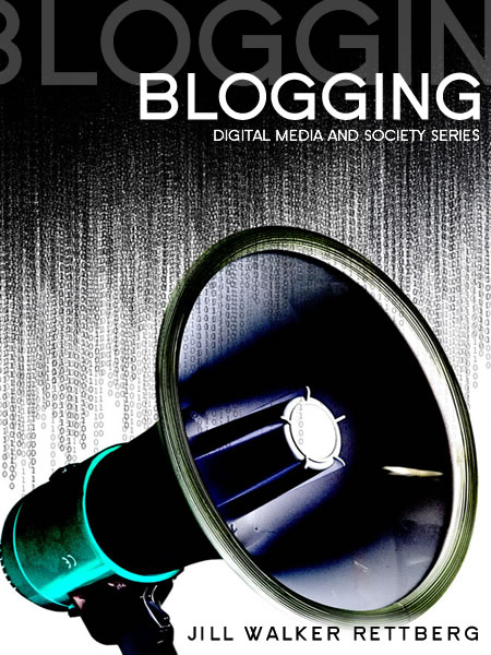
I belive this one is more appealing and better. The layout of this bookcover is imbalance and it makes a focus to people. The background looks very dynamic since the strokes creates stress and suggest a feeling of motion. It show the impact of the loudspeaker which relates to title of "Blogging" and its influence. I thnk it conveyed the message more sucessfully.
No comments:
Post a Comment