Blog for Assignments

o(°∀°)o

Sunday, December 6, 2009

The Anatomy of a Visual Message


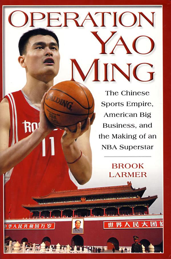
The is the example of representation in visual message. It connects to what we see on the cover. The visual message is very direct that this book cover is just showing the photograph of Yao Ming and Tiananmen Square. This is the direct reporting of visual details. When viewers look at the image, they can know that it is something aboaut Yao Ming and China instantly. It also makes the viewers to think everything about Yao MIng.


This is an abstract painting from the scan of Jean Metzinger's oil painting Still Life. Many of the visual details are taken away and visual elements are reduced. The message is depending how people percieve from the compostion and its structure. This painting I is a presentation of a group of objects on a table. Viewers can only recognize it by some parts of its compostion. The message is distilled to show the meaning of "still life" only.


This an example of applying symbolishm. There are many arrows on the cover and all of them are symbols. Thery are just  shapes that combine triangle and rectangle, but people recognize them as arrows. Arrows are the symbols for direction. The arrows on the book cover are all point up and it suggest the meaning of moving up. The visual communication of this cover is simple and universal. Views can easily understand its message.


Reference
http://www.artsmia.org/mia/e_images/06/mia_6862e.jpg

Sunday, November 22, 2009

Visual Techniques


singularity, neutality, instability, simplicity, activeness, depth


economy, flatness, accent, simplicity, asymmetry, instability


  Both of the book covers above has used the technique of simplicity. Because they don't have many details, the visual messeges are very easy to see. However, the first one has depth and the second one has flatness. The first one tends to have a feeling of space and it help to create a sense of reality. The second one chooses to leave out the feeling of space and it shows the strong contrast between the object and the background. These two covers are also similar in the way that they both are imbalance. The first one is the chairs and the second is the book and the person. However, their effects are different. Because the neutrality of the first cover, the feeling of imbalance is not as strong as the second one. It just suggest the motion of the chair which conveys the message of reliability and the relationship of love. The second one has the technique of accent and it amplified the effect of imstability. It makes the illustrarion of the book in the cover seems to be a burden to the person which effectly depicts the title of the book. Both of these books use visual technique successfully.

Sunday, November 8, 2009

Week 11 CONTRAST in design


The image above is a sucessful example of using contrast in the design.
The designer use contrast in color and sucessfully attract viewer's attention. Yellow and white on the gray background create enough contrast. The designer also apply contrast in compostiion. Circles on the cover do not place orderly and regularly. Some of the circles are being "pushed" away from the oringinal place. It sucessfully conveyed the message of the title of the book. Overall, the designer puts enough weight on both the book title and the illustration, so it does look too leveled.


Images above is an example of bad use in contrast. The rainbow color on the web page lower the contrast effect and become intrusive and messy. The compostion of this site is the worst problem. Too many things are crammed in this page and it does not have a hiearchy and it does not direct viewer's eye. This unorganized page has no control on visual statement. The result is ambiguous and the effect is frustratrating for viewers.


Reference

http://seenbooks.blogspot.com/2006/12/disorders-of-memory-and-learning_08.html

http://www.burlingtonnews.net/burlington_ufo_center.html

Sunday, November 1, 2009

Implied Movement in Design


The poster above is an example of using implied movement in visual design. By applying diagonal stress in the poster, people tend to follow the direction of words. Moreover, we perceive movement because in Getalt law we expect to see patterns to continue. Variation on sizes of fonts also suggest change and movement even though nothing moves. This poster conveys the energy of movement. All the factors are working together to create a strong visual effect.


This is also an example of implied movement. In the picture above , we can see that a girl is scratching her hair.
Lines around her hands suggeset the direction and the movement of her hands. Because of that, we can feel that her hands are moving although it is a static picture. The extra two arms tell the viewers the starting position of her arms and this enhance the movement of her arms. Also, depending on the context (her expression and lines), we can interpret that she is scratching her hair rapidly. The effect of this picture is very strong and clear.

Sunday, October 25, 2009

Dimension, Scale, and Space


        Perspective and dimension are important in both manga and graphic design. By applying depth and space into the composition will allow the  picture to have reality and  the visual message that the content conveyed will be more persuative.  In the picture above, the relative size of the hands and the body act as a cue of depth. It shows the position of each part of the character's body. The shadow on the ground show the distance between the character and the ground which also make the character to be much more real. The flow of the clouds in the sky,and linear perspective and the texture gradient of the ground are working together as other cues of depth and space. Viewers that see those cues will perceive the dimention in the picture and sucessfully put enough emphasis on the character.  Because of dimension and space, the character is effectivly expressed.

Monday, October 19, 2009

Tone and Color


           Illustration, which can be used on book cover, packaging, or the content of books, is a good example of utilizing elements like tone and color. Tone is operating significantly in the illustraion above. Tone helps to define lightness and darkness in the graphic and creates the feeling of dimension. Tone also tells how light is reflecting on the subjects like clothes and statue in the illustration which shows the reality. Tone let people to see the different levels on the image and disguinsh the object.
           Tone is usually interacting with another visual element which is dimension. Tone shows shade and light that help reinforcing the sense of reality and distance. It aids other method sof plotting space to visualize the objects.
          Color is also important in illustraion because color can stimulate emotion feeling and define the characteristics of the subject in the illustrantion. Color can convey messeges together with tone. For example, color tells the material of swords in the image above. Moreover, depending on what kind of color theme that the illustrator used, the illustraion can have different feeling. Using black, grey and deep blue can shows elegancy and seriousness. Color can also used to show the contrast by applying complementary color just like using black and white.
          Color and shape have interesting relationship because shape always have a color, or you may say that color helps define shapes. Since color has strong hiearchy, things that has similar color are more easily seen as one shape. Furthermore, color and shape together can convey more message rather than just by one of them all alone. Circle is just a circle but a yellow round shape can be interpreted as sun or coins.

Sunday, October 11, 2009

Web Design

LINE


           Line is the basic structure of web design. It can be  frameworks and textbox on the web page or it can be implied as the boundary of two blocks. It also can be border, divider, contour, or decoration.  Even though it may not be seen on finished work, lines can also be important in planning website like grids and columns to provide clear structure whic increase readability . It is also a useful too to connect elements and enhance comprehension of design.


SCALE


      Scale is important in web design when dealing with the lay out of the web page.  Right kind of scale can relieve viewer's eye and help convey the visual messege more clearly.
For example, you do not want your header and your side bar to be too large that make your main content, where you put the most of information, does not have enough space.
Each element should be put in a appropriate scale and proportion according to their function.As architect has the famous "Golden Mean", web designer also apply golden ratio to arrange their contents. They use the ration to decide the size of different columns. Using scale in design can make it aesthetically pleasing.


COLOR


         Color is so essential in most of the visual design field and web design is not in the outside of this range. Color creates feeling and there are many color theories in the world. Designers have to choose a good color theme to reflect the site they are designing. It is also important to consider your audience because different colosr convey different messages and connect different emotinal feeling. For instantce, children like brighter color and men tend to prefer cooler colors. Color also has fashion and seasonality , so it is important to consider a color theme in web design.


Reference


http://net.tutsplus.com/tutorials/other/the-golden-ratio-in-web-design/

Sunday, October 4, 2009

The Synatical Guidelines


I found this book cover is not so good because it looks
uncomfortable. The monotone background created the feeling of leveling and the layout of the types are balanced. However, it doesn't tell much about the book and it can hardly catch people's attention. I think the readers would be easily misunderstand the book just by looking its cover.


I belive this one is more appealing and better. The layout of this bookcover is imbalance and it makes a focus to people. The background looks very dynamic since the strokes  creates stress and suggest a feeling of motion. It show the impact of the loudspeaker which relates to title of "Blogging" and its influence. I thnk it conveyed the message more sucessfully.

Sunday, September 27, 2009

Visual Language


Manga is the Japanese name for comic and  pictures above are two different manga series that are translated in Chinese.
The picture on the left is showing a fighting between three monsters and a "gorilla" is running away from the battle after it see that one of the monsters is eating  two other monsters.
First, it shows the scene of the fighting and then shows the power of the winning one (it begins to eat another). After that the scene changes to the "gorilla" and shows its expression. The dialogue frame is in the irregular spiny shape to show the cries and emotion within them. Finally, the panels are showing scenes that the "gorilla" decides to run away.
The layout  and sequence of the panels is according to the reading style of Japanese which is the right to the left. The eye movement of people who used to this reading style will read from the right to the left and from the top to the bottom.
The picture on the right is the conversation between the women and the man. It shows the rejection of the woman and the response of the man. It emphasis on the scenes and the dialogue of the women in order to show her feeling and her expression.
In the manga, exaggerated facial expressions and movements are used to show certain qualities  like humor, scare, and surprise. Also, the background under character may be used to show the feeling of the character by applying focus line, lighting, flower, bubble, mist,hazy rings, shadow,etc.


Sunday, September 20, 2009

Visual Thinking Research

The result of my brother


The result of mine


For the stained-glass one, basically it just need the least amount of strokes to finish the pattern.
Both of us tried to draw the inner part first then finished the outer circle. The drawing process for inner parts are pretty similar: we used longest lines to reduce the turns. However, our procedures of how we deal the outer parts are different. I tried to finishe the circle first and completed the last two straight lines and he tried to finished the straigt lines first. Therefore, the numbers of strokes we used are different.
For the space one, it also the least amount of lines possible to close all the spacepods. Both of us failed to use the least amount of lines ,which is four, even though our strategies are similar. We want to draw lines that can across space between as many spacepods as possible and then close up them. However, we failed to find the best spot. His result is 5 and my result is 7.

Saturday, September 12, 2009

Feature Channels and Visual Search


The picture above is NIKE ID poster for the Nike Store.


People's attention is unconciously attracted by certain elements and those elements are feature channels.  We can easily notice some differences over others. If we apply powerful channels in the design, we can easily catch people's attention. For example, the outdoor poster above would be seem to be pop out when we pass by becasue our color feature channel would dectect the red orange background preattentively. It can grab pedestrians' attention. Using feature channels can help important things to be first identified.


Reference 


http://blog.largeformatposters.com/smart-design/how-to-make-striking-poster-designs/

Tuesday, September 8, 2009

Top-Down Visual Processing

    Pictogram, according to Wikipedia, is an ideogram that conveys its meaning through its pictorial resemblance to a physical object. The picture above is the pictogram of polo. Our brain didn't just see several shapes and lines in this picture but rather a person who is riding on a horse. It is because our brain expected to see a person and our brain tried to match the image with our expectation. This kind of goal-biased attentional looking which is called top-down visual processing in visual perception. Top-down visual processing is important to graphic design and visual communication design since graphic designers create illusions and images by applyting this concept in their works. Logos and pictorgrams are great examples of that. Because people's visual perception is biased and goal-directed, designers can use visual principles that based on this process to unify their designs.

Reference

http://mozglubov.blogspot.com/2009/01/top-down-processing-in-visual.html